Music meets Art in Ukraine
On the eve of writing this material, Ukrainian motifs sounded in my head: the whole stoner, post-metal and even acid jazz. Album art came to this region relatively recently, it is not more than 30 years old.
At the dawn of the album design, DIY probably lived on the desks of apartments under the light of table lamps. Each music or movie lover aged over 30 have similar samples of creativity and design. It could be self-painted cassettes or small circulations from a black-and-white copy machine from the original film, vinyl or even CD media that was rare at that time.
Album design can easily be limited to the cover now because this is all that is needed for a digital release. But, since in recent years, interest in physical media has returned and more and more people want to put their favorite release on the shelf or touch it, the design of discs, records and tapes continue to live and develop.
We made a small cut across our country in this material, taking mostly more alternative mass scene releases. There is no beginning in this story yet, since artifacts of the epoch of origin of the Ukrainian album art are still being sought. And there is no end since each of us continues to write history, even at the moment of reading these lines.
So let the history begin…
At the end of 2016, Aby Sho Music label released a record dedicated to the Kyiv underground - Kiev Underground. This is the first part of the collection, which is devoted to the period from 1986 to 1995. It includes В.В., Раббота Хо, Коллежский Асессор, Перрон, Эр.Джаз, Банита Байда, Затерянный Мир, Adem, Квартира 50, Иванов Даун и Дети Майора Телятникова (VV, Rabbota Ho, Kollezhsky Assessor, Perron, Er.Dzhaz, Banita Baida, The Lost World, Adem, Apartment 50, Ivanov Down and Children of Major Telyatnikov). The preface to this edition was written by the famous Kyiv rock journalist Alexander Yevtushenko. In addition, the editor-in-chief of the Muzmapa was noted at the collection with his introduction and a look at the music of those years from the side of the new generation.
The most remarkable detail in the design of this vinyl is, perhaps, the map of the Kyiv underground. It is stylized under the scheme of lines of the metro, but the names of bands are indicated instead of stations. Also, on the diagram there is, for example, the Lukianov-Mesozoic line and the symbolism of the totalitarian era.
A collage of old black and white newspaper clippings was placed on the front of the envelope. In the booklet, there are photographs of all the bands of that time, and authors of songs and band members are written under each photo.
Andrew Smirnow, AbyShoMusic label:
"
The author of the idea is me. I also came up with a release symbol: an inverted outline of the monument to the founders of Kyiv near the title of the collection. All materials were provided by a collector and connoisseur of Kyiv music of that period Sergey Spodobaev. He is the compiler of the album. Materials for the design were clippings from the music page (app) "Phonograph" and the Kyiv newspaper of that period "Moloda Gvardiya".
Materials were taken in one way or another related to the participants of the collection. Visual performance - Evgeny Volodko, designer AbyShoMusic. The map on the tab is taken from the same Phonograph, and was composed by music journalist Alexander Yevtushenko. The idea was implemented under the tone of faded newspapers and was combined with the general color scheme of the cover.
Bands on the branches - as the development of various musical styles. The farther from the center - the younger is band and style. But the direction of music on each separate branch is similar. Apple's design beats the "pass" to the Kyiv underground - the subway. At that time it was 5 cents, and we decided to depict it in the form of the Soviet 5 cents. This penny plays with the slang name of the central label of the plate at that time - penny".
Until we talked to all the commentators of the article, the descriptions of the chosen album art were based on guesses and assumptions. Therefore, the first part of the description is the transfer of sensations and associations of one of the authors of the material. But, even having received all the information, it was decided not to change anything. On the contrary, it became interesting to compare how much one’s own opinion coincides with the idea of the bands and artists themselves.
Party people of the late 1990s - early 2000s and Moon Records customers 100% remember such a team as Contrabanda and its album about hate. Little is known about the band - they are from Lviv, four members (Alex Zaitsev - vocals, Vadim Tarasevich - guitar, Igor Priyma - bass, and Mishishin - drums), and the album was released in 1999. After this record, the band released another LP called "Zoom", and this is where their discography ends. According to some publications, the band plays hardcore, according to others - hatecore.
The design of "100% Hate" depicts something in the spirit of guro and terrible animation. For the end of the last century and Ukraine - a categorically uncharacteristic design of discs. This is why it sinks into the soul. The content inside corresponds to the outer shell. Judging by the disc itself, the cover is author's and is not related to any cinema or art products.
We have long established who made the cover and could not disregard it. As a result, we found the vocalist of the band.
Alexander Zaycev, vocalist of Contrabanda:
"Cover author Andrei Davydovsky... At the moment, a prestigious photographer, artist and clipmaker in Moscow.
The cover is created from 9 separate drawings. Each drawing refers to a separate song on the album "100% Hate". Images on a disc with a reversal, texts, etc. were also developed, but it never came to that. Everything ended with a tape on Moon Records and only then moved to CD".
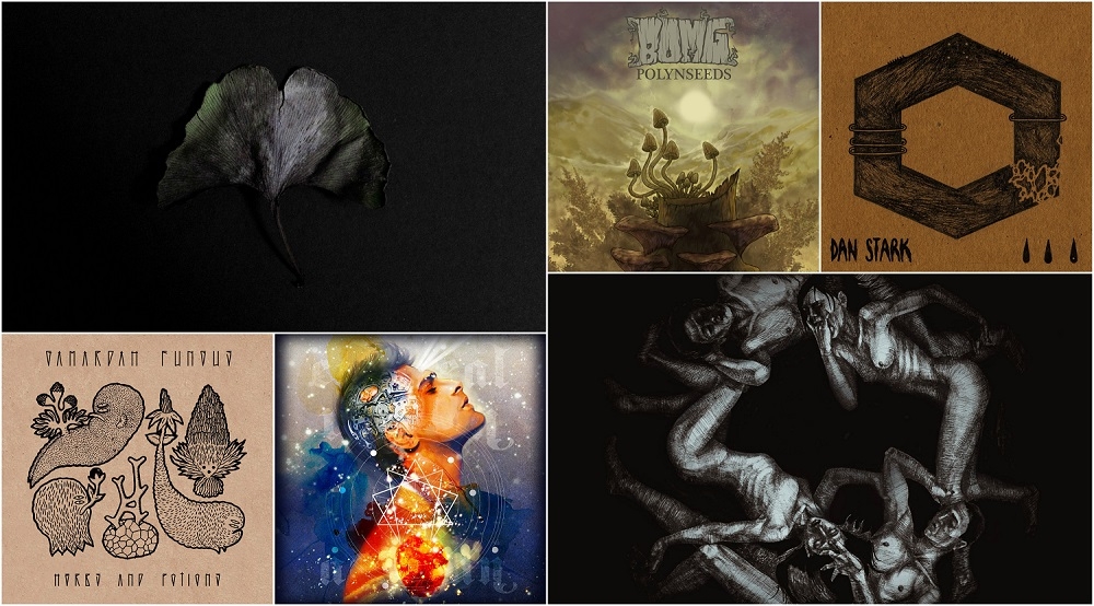
And once we've started this theme, the punk-hardcore scene cannot be ignored. And why, when there are excellent examples of covers with original and philosophical overtones. For example, Dan Stark - s/t sample 2012. On the title page for the CD, a hexagon with coarse strokes is drawn with three brackets on the left and one on the right. Its lower right corner is shattered. Below are three drops and the name of either the band or the album.
Solid symbolism and subtexts. On top of the hexagon are depicted some small protruding spikes and four points, also, apparently, for good reason. In fact, this whole scene is not simple, with its own laws of genres, specific behavior, DIY and world views.
The complexity and seriousness of the approach create an aura that is understandable only to a narrow circle of people because art abounds in both direct messages and a mass of encrypted messages. Very often without drugs, alcohol, and hedonism. The artist did not want to comment on his work, explaining that it is difficult for him to give answers to the questions posed.
We've tried to get some details from the vocalist of Dan Stark - Dron:
"The question is complicated, because everything that we see on the cover is the fruit of the work of Yaroslav Hrob, so I’ll just repeat his words:
"Life is a complex construction. The fateful turns are closed in a somatic circle. The destruction of isolation is the path to Utopian freedom. Conscious self-destruction"."
Looking at the design of the Bomg band for their release of "Polynseeds" immediately comes the feeling of being in the mountains during the off-season. The action takes place either in the fall or in the spring. Tones on the art are of pale shades, perhaps due to the fact that the sun sets and dusk approach.
An image for the LP was created by Kyiv illustrator Viktor Absurdo. The picture itself was made in a vertical format, so you can immediately assume that a universal format was created for a CD and a tape.
It seems that the Kyiv team has released a conceptual work on travel. Only it was not a tourist guide that came out of it, but a psychologic one. There are mushrooms in the front cover of the album, wormwood bushes in the back. Both substances are suitable for use as food and decoctions. The effect of several cooking methods may be unexpected. And if the background is played by a Bomg band…
Viktor Absurdo, illustrator:
"There is a clear relationship between the cover and the content of the release and the name of the album (polynseeds), as wormwood grows in the center. The illustration was drawn directly for LP, a couple of raw recordings were given to listen in advance. When I was drawing this art, I was inspired by the music of Bomg and shots from Soviet travel films. In particular, the film "Земля Санникова" ("Land of Sannikov"). This was a separate request from Nikolai Temchenko (frontman of the band - ed.).
The motley coloring of the picture is an attempt to convey my impressions of the mushroom trip in the mountains. It turned out, of course, faded in comparison, but this is approximately the motley gamma that I remember. I drew it then as a simple illustration, not thinking about the format of the cover. So it turned out that the format was vertical".
The experimental and dark ambient scene of Ukraine is very well-known to the foreign listener. Partly, it was because of the composers of sound landscapes, field recordings and otherworldly sounds that it was possible to promote the national flavor beyond the borders of the country. Many of the authors experimented using sound and visual ethnic Ukrainian inserts.
Regarding this, the Gamardah Fungus are well advanced. Not one of their releases is left unattended, and even the golfstream editions of our latitudes give them attention. In terms of works of album art, we want to include "Herbs And Potions", released in 2016, in the list of this article.
The cover shows Artemisia, Bryophyta, Belladonna, Mandragora & Hypericum - these are five different types of herbs that grow in Ukrainian forests. All of them can harm a person or benefit - depending on the purpose and the process of their preparation. Cover author Andrei Khir depicted herbs minimalistically, but with plant-specific details.
The album records used guitar sessions, which were written in the Ukrainian forests. As the musicians themselves write: "The idea was born by itself - the herbs whispered it to us when they rustled under the gentle hand of the wind".
Ihor Yalivets, sound designer of Gamardah Fungus:
"There is mix of nature and mythology on the cover. As if the herbs are inspired. It depicts rather not the roots, but the herbs themselves. In the mythological sense, of course.
The font depicted on the title page was developed personally by the artist for this release. We have already released a new album with a different font and a cover from another artist.
We had three albums in this style. Like a trilogy. A cover from the rough processed cardboard and an ink stamping on them of a vector image. The following albums will differ in sound and in design.
The last album for today is the artist Kol_Belov, the previous one was done by Andrey Khir, and before that, a designer from London worked on the cover".
In the same 2016, deathcore band Crucify Me Gently from Uzhgorod released the album "Circles". Its design is a black background, which depicts human bodies in a circle - two naked men and two naked women.
This is not exactly album art, as artist Julia Kovach first painted a picture of a meter per meter, from which an illustration was later released. The musicians themselves during the writing of the release were inspired by the works of G.F. Lovecraft and Edgar Allan Poe. Their LP is "this is a tragic, existential ode to a human being that faces unthinkable pain - before and after death. Transcendental horror that can overtake any of us".
Julia Kovach, illustrator:
"The picture is made with ink by feathers and black acrylic on pastel drawing paper. According to the latest data, the canvas is by Alexei Rusnak (vocalist of the band - ed.). I decided to draw on a large format because I always do that; a small format does not allow overclocking, let's say.
We specifically looked for thin people for this work, laid them out in a circle (that is, as they are located on the cover, as we live and laid them out), then took a photo and I drew it from it. So, in fact, sketched from life. The process took one month".
"The second trip from our essence and consciousness to the stars and galaxies through the desert and the stones of our existence. There are always steps in the way of knowing life and death, in thinking about the end and the beginning and who is watching us on this way. Regardless of whether it is a line or a cycle, go through it with Risin Sabotage," - the band writes about its album "Planet Dies".
And on its cover is some kind of apocalypse, made in bright colors. And whether it is the forerunner of the storm, or the last spacecraft left the dying planet. It is made in the best traditions of style, all according to the canons and formulas of stoner-bands: fonts, picture, concept and color range. Art for the album of the Kyiv band was painted by Brazilian artist Cristiano Suarez.
Igor Nedd, Risin Sabotage drummer:
"We've found him on Instagram. Talked a little bit, became friends, and later began to discuss the work. He scored $500 for us, but after listening to the album, offered a discount and agreed to make a vinyl cover for free.
The idea of the design lies entirely with Cristiano. This is his vision of our music as a concept as a whole. Further, if possible, we will work with him again. He is a great artist and knows what he is doing. Always worth it.
In general, the release cover is not entirely associated with its name "Planet Dies". This is a ship with us that flies through the planet and almost falls into the hands of an alien monster. Also, on the reverse turn of the album under the playlist are astronomical designations of the planets and luminaries.".
Dark country and folk appeared on the territory of our country for a reason. It can be assumed that this is Polish trends (remember last year’s release of Me And That Man). But there is another option - just Sasha Boole, with the help of an acoustic guitar and poems, can speak to people without the help of fire, sweater, kitchen, and an upset music score. He can write beautiful poetry without accents on the state and the constant "against" and successfully convey ideas that are of concern to everyone.
Much has already been said about his albums, lyrics, and music. Let's now talk about the design of a specific release - "Survival Folk".
It was made by artist Anton Arshinin, who, like the performer himself, also hails from Chernivtsi. On the cover, we see the hand, the cross on it and the snake. Perhaps she is being stifled. Drawing on a black background and made in the traditions of the genre. That's what he and dark folk with no less dark country.
Sasha Boole:
"For me, this cover is multi-layered. In many spiritual practices, the serpent symbolizes fear, and the image thus tells us about comprehending this fear. Also, the snake often depicts wisdom. Everyone sees this image in its own way. For someone - the hand squeezes the snake and does not allow it to escape, and for someone - the snake is preparing to bite the arm, curled around it".
Commentary on the following album art fully explains the main ideas of the release. We have nothing to put in the LP description "Aeonian". The frontman of the band said everything for us.
Val Kornev, frontman of Ethereal Riffian:
"The album was designed by Mila Kiseleva - an artist and graphic illustrator from Moscow. She also has a painting studio "Texture of Color". She drew for us "Aeonian", "I AM Deathless" and another art that we used to print on T-shirts: we talked a lot about spiritual practices and shared our experience when we worked on these releases.
The work of art creating took a lot of time, for various reasons. We did not succeed at all to come to a common denominator at first, we could not do anything the first time, but when the intuition was turned on, everything started to turn right away. I do not remember exactly, but, in my opinion, the work took at least 9 months.
On the title image of Aeonian, there is an enneagram, and Mila suggested using it since she was then actively engaged in the Gurdjieff group. The Gurdjieff Enneagram is a sacred universal symbol in which the great cosmic laws governing the universe are encrypted.
If you look at the head of a person, you can see two main elements:
1) Mechanisms and schemes are the symbols of the intellect and the ego, with which a person identifies himself most often, thus refusing to directly/intuitively cognize reality. The schemes have little in common with the true picture of reality and life itself, it’s just our limited way of describing reality, which we, because of our own ignorance, are beginning to consider the only true one.
2) A child is a symbol of how a kid sees the world - openly, without schemes and restrictions. For a child, everything is wonderful. Our problem is that when we grow up, we kill this metaphorical child and often for the rest of our lives we remain under the influence of restrictions and schemes formed by our environment and time in the one we live.
Now about the title. "Aeonian" means eternal. Eternal search man of his true nature. At the root of this word is the concept of "eon". An indefinitely long period — maybe 100,000 years, maybe 1,000,000,000 or more. Time does not matter. It does not matter when the call to such a search finds man, today or a hundred thousand years ago, because this call is timeless in relation to human nature. Man has very little time left in this world, and he is as small in relation to the universe as an atom in relation to the size of the human body. Despite all these limitations, the greatest gift of man is that he can achieve the full realization of his potential and reveal his true essence. In other words - stop being an idiot, which almost all of us are. If you do not agree with this statement - look around. If we were not idiots, there would not be so much suffering in the world - starting from our relations in the family and pumping us with global conflicts and wars. This is not someone does with us - it's all our hands. Every thought, every emotion, every perfect or imperfect action - this is the world around us".
If this is not enough, then you may be interested in the book that the band members wrote specifically for this release.
At the beginning of the year, the new disc of Somali Yacht Club was released. Their long-awaited album was called "The Sea" and we already had a little talk about it. In a review of LP, Lviv artists have already mentioned artist Dasha Pliska, who completely created art for the release. The design came out as conceptual and philosophical. The monochrome cover depicts an old man with a hand in which there is a ship on the water with lowered sails.
Musically, the new Somali Yacht Club is quite calm. Therefore, apparently, the vessel is on the cover during the calm. But the old man himself and his sophisticated profile... Obviously, there are characters in the image that require certain decryption.
The album was released by Robustfellow Prods. Therefore, it did not go without a unique approach to physical media. The release was released on CD, vinyl, as well as a limited edition in a box. The booklet, among other things, depicts birds flying in thickening before a cloud of storm. Commentary on art gave its creator.
Dasha Pliska, illustrator:
N: What is depicted on the design - the calm before the storm? The elder symbolizes the storm, and the ship with lowered sails - calm? Or something else?
D: Many characters are used in the cover, I think everyone will see something in them.
N: Who developed the idea and tone design?
D: The guys sent me the tracks, the lyrics and the general theme of the album, and in the work they gave me complete freedom, so that the whole graphic part is mine.
N: How much time was spent on work and do you plan to cooperate with musicians?
D: It took about a month to work on the cover and all the illustrations. This is not our first collaboration, so perhaps there will be subsequent ones.
Three releases in this review are combined by one label, even some kind of sound system with artists, musicians, writers, managers and sound engineers. We don’t have any bias towards the underground and other representatives of it - we just reviewed too many pictures of Ukrainian bands and caught up with the cooperation of musicians, artists and producing companies.
Says Phil Dobrov, founder of Robustfellow Prods.:
"It is always a pleasure to work with bands who carefully think over the visual design that accompanies the release. As for Somali Yacht Club "The Sea", from the start, there was already completed art for each song. This made it possible for the label to fully develop and implement parts that are usually have not enough time for. I am glad that I managed to convince the band to consolidate a new logo for "The Sea", which was developed by Vadim Kulinchenko. Sailing logo fit perfectly on a variety of merchandise (t-shirts, bags, caps, hats). The patches offered by Yaroslav Prokopchuk (Robustcrew) deserve special praise, perhaps the case when a good design sells itself. And Lena Ushakova created an amazing animated lyric video for the composition "Blood Leaves a Trail", interpreting the text in her own way using images from a deck of tarot cards.
Inspired by the excellent round drawings from Dasha Pliska, and the powerful album of Somali Yacht Club on the CD, after several sleepless weeks, having shoveled a dozen prototypes, it turned out to create a limited box, which I hope, conveys and in some way even emphasizes and complements the overall concept of the release.
The relief white sand beach of acrylic, mini-compass, glasses from the Black Sea coast, a set of round cards with art/lyrics, an exclusive black mark (it is also a download card), a sticker and a patch. Possession of this edition gives the understanding that you are one of the 75 happy owners of an exclusive, and surely this will not happen again".
If we had a writer's circle, then we definitely had to arrange a competition for the description of the covers of Ukrainian underground performers. And at the same time give young Gestaltists (these are such psychologists) the ground for dissertations. And then arrange a competition for the best literary essay, mixing the texts sent to us with scientific works.
And no joke - a year ago, when the Music meets Art project appeared, an idea arose to make an exhibition of posters, album art, paintings and everything that links art and music together in Ukraine.
The ground for the collaboration of artists and musicians is very fertile, and this can be seen even in a dozen works described above. Who knows, maybe the magic of the letters of this text will bring a massive demonstration of the strokes and tones of some creators with the sound of others under one roof.
NB: from not included in the material - without comments of the participants of the process.
The cover of tapes and CDs "Було не любити" ("Should not have loved"), released in 1994, is an image of a piece of sacking on which is placed on top of a portrait of a topless woman with a Ukrainian wreath on her head. Above is written the name of the band with the anarchy icon instead of "A", everything is as it should be for a real punk. True, Брати Гадюкіни (The Gadiukini Brothers) never played it, but they were always insurgents in behavior and songs.
For the first half of the 1990s, such a design didin't not raise questions, because of the general permissiveness after the fall of the "Evil Empire" people rode the roof. The design for the release was made by the Lviv artist Orest Makota, who stood at the origins of the hippies of the western cultural capital of Ukraine and was one of the first pioneers of modern art in our latitudes.
Later on, in the following editions and reissues of the album, two prominent fragments of the panel in the photo will be covered up with the words "allowed to censor". The album was released by several labels that surprisingly didn’t include Moon Rec. First, it was released by Caravan, then Lavina Music, continued by MO Garba and completed the reissues of RG Music.
Little is known about the hardcore band from Simferopol, as well as about most bands of this style. Some of them left the peninsula and moved to mainland Ukraine. The singer of Memorials lives in Lviv and publishes collections of his poems. The band did not announce the official collapse.
But you can look at them in the form of their release "Кулуар" ("Couloir"). In the center of the envelope is a leaf from a tree. In the design of the records, the band used the herbarium of the ginkgo plant, it is also the "silver apricot". Usually, the Crimean bands love other dried plants, but this band most likely decided to encrypt some message in the album art.
Ginkgo Biloba is one of the oldest plants on earth. Sometimes it is also called the stone tree. Its age is more than 300 million years. In Japan and China they are planted near graves and temples. We would venture to suggest that due to the age of the plant and its uniqueness, the band decided to talk about the deep and possibly secret meaning of its release. That there is something more important than the couloirs themselves. The vocalist declined to comment.
But the design of the disc is impressive not only because of dried ginkgo. This is, in fact, a full-fledged book of poems by Memorials. There is in it both a hard cover, and texts, and illustrations. Edition differs from an ordinary book only in the presence of a disc and release details.
By the way, the album is dedicated to the memory of Nikolai Zakaldaev, who died in Crimean Mountains in 2011.
***
The material was created with help of Neformat Family: Yarina Denisyuk, Alexander Masovets, Philip Dobrov, Valery and Yulia Kornevy. Also, musicians, artists, label owners as commentators. Thank you!
Previos parts:
- Music Meets Art Vol. 1
- Music Meets Art Vol. 2
- Music Meets Art Vol. 3
- Music Meets Art Vol. 4
- Music meets Art vol. 5
- Music Meets Art Vol. 6
Material is made in parnership of:
RobustFellow Bandcamp Facebook VK Twitter
Ethereal Riffian Bandcamp Facebook VK
All images are copyrighted by their respective copyright owners