Music meets Art vol. 2
What’s album art, who invented it and in what direction is it going? How to transform the sound into illustrations and which artists cooperated and continue to cooperate with musicians? These matters as well as many others are covered in continuation of our series of articles about album art.
The 1970s have brought revolutionary changes in the world of music in terms of sound, image of musicians, approach to behavior on stage, general uninhibitedness, and commercialization of experiments. These factors also influenced album art as well as other spheres of the musical world. The decade turned away from psychedelia very slowly and top bands released numerous products of outstanding quality. At that time designers had a constant workflow and started working on the new artworks every day. Photographers also had a lot of work to do.
We plan to research "Music Meets Art" topic using the inductive method moving from general picture to its individual components. Stepping over the decades, we will get back to the starting point and will closely study the album arts that deserve discussing. Also we will analyze each segment of artworks down to tiny details and meanwhile offer you to go on an aeronautic trip through different eras. We will see the whole picture better if we look from above, so let’s imagine that we’re flying on an old zeppelin. With its slow speed we will have enough time to discern some album arts.
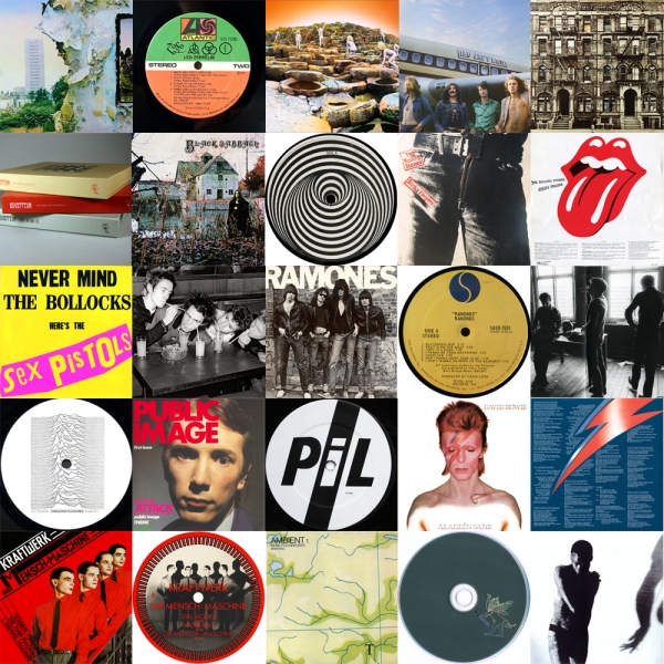
Speaking about zeppelins, one of the most productive and loud bands from the 1970s were Led Zeppelin. During that decade they recorded 5 albums, 3 of which are still in the minds of critics and not just because of music. The first album on our list is 'Led Zeppelin IV', which came out in 1971. It is also called an “anonymous album” because there are no inscriptions on the artwork. Album art pictures an old wall with a picture where a man carries an armful of brushwood. Supposedly, this picture was painted in the XIX century by an unknown author. Robert Plant bought it in a pawnshop. On the back side of the band’s fourth release, the ruins of Birmingham along with the Salisbury tower are pictured.
The idea behind this artwork was to show the balance between the village and the city, remind about the ecology and caring attitude in regards to the planet where we live. All these elements, namely – absence of inscriptions, balance of urbanism and nature, unknown author from the XIX century and the hermit from Tarot card pictured on the inner side of the album, give a lot of food for thought. Evidently with “anonymous album” Page and Plant launched an excellent philosophical trolling.
At that time Jimmy Page was mesmerized by the dark forces and personality of Aleister Crowley. He even bought his mansion. According to rumors, if Page didn’t sign an agreement with the devil, then he definitely shook hands with some of the demons from his hierarchy in order for the band to become that successful. Whether it was devilish forces, concatenation of circumstances or just a lot of hard work, the career of Led Zeppelin skyrocketed.
Success was followed by lots of bad luck and misfortune, which may have led to disasters and in some cases really resulted in tragedies. Evil atmosphere literary started to surround the band. Owner of the land, who sold Crowley’s home to Jimmy Page committed suicide and the administrator who was related to the deal died in a mental health facility. Robert Plant with his family got into a car accident. Later Plant’s son and Led Zeppelin’s drummer John Bonham died.
As for Jimmy Page’s interest in the occult and Crowley – it will many more times find its reflection in the band’s music. The band Coil will also find inspiration in Crowley’s work, but that’s a different decade and a different album art so we’ll keep discussing Led Zeppelin’s artworks for now.
Album art for the next album of the band − 'Houses of the Holy' is also worthy of our attention. I’m sure you have seen it many times – it pictures children who lie, sit and climb giant boulders. This collage was created on the Giant's Causeway in Ireland. Models for this album art were 6-year-old Samantha Gates with her 4-year-old brother Stephan.
The photos with children were colored by hand because the weather during the photoshoot was cloudy, while Storm Torgeson and Aubrey Powell wanted to make it look like the weather was sunny. Both artists worked in a popular British designer agency Hipgnosis that became famous thankfully to the album art. This agency created artworks for Pink Floyd, UFO, The Alan Parson's Project, Genesis and many other bands. Peter Christopherson from Coil also worked in that agency, but again we will talk about it later.
And of course it’s impossible not to mention 'Physical Graffiti', the third and the last important album of Led Zeppelin from the 1970s covered in our article. On the album’s artwork you can see a photo of a symmetrical house where letters with the name of the release are inserted in the windows. Designer of this album art was Peter Corriston who has also worked with New York Dolls, Tom Waits and The Rolling Stones. 'Physical Graffiti' was nominated for Grammy as the best album art and was many times included in different tops of the album art.
Interesting facts: as it was already mentioned, the creative work of the band has references to Aleister Crowley and during the record of the album 'III' there were two master CDs which had Crowley’s quotations on them. Original records included such quotes as: 'Do What Thou Wilt Shall Be the Whole of the Law', 'So Mote It be', 'Love Is the Law' and 'Love Under Will'.
When the first press of envelopes for the records was issued the name of producer Terry Don Manning was missing there. Jimmy Page ordered to destroy this press and invested his own money to print the new one, which became an original press for the 'III'.
Information about the next band was provided by Necromandus, who can talk about these founders of Neformat’s favorite music styles with more authority than Wikipedia.
Black Sabbath – S/T is one of the iconic albums from the beginning of the ‘70s. Some people may say that Black Sabbath was not the first band to play metal”, and they will probably be right. But the notion that it was them who started playing music resembling doom metal is unmistakable.
Let’s look at some facts. Black Sabbath recorded and mixed this album in the beginning of 1970 and their manager received about 15 refusals from different music labels before Vertigo Records management (new subdivision of Phillips/Phonogram concern) expressed interest in Black Sabbath’s self-titled album.
By the way, before Black Sabbath’s self-titled album Vertigo had only six albums. As it usually happens in such cases – the band didn’t pretend to influence decisions about album art at all. Keith MacMillan (who is more popular as Marcus Keef) was designing the artwork.
Composition of the album art consists of the old building and a woman who looks more like a ghost. The building is the Mapledurham watermill situated in Oxfordshire. This watermill was built in the XV century, rebuilt after the Second World War and since that time it has functioned normally. The woman from the photo was hired personally by Keef. If we apply our imagination we can suggest that this woman is holding a black cat in her hands.
And now imagine yourself in the shoes of the melomaniac of the beginning of the 1970s. Television still isn’t developed much, music videos are a rare thing and visualization of music happens only through album art. You buy the release, put on your headphones and start listening to music while studying the cover art.
So, you unpack the album and see the inverted cross with a short but very grim story. The needle touches the vinyl and the first thing that you hear is the sound of thunder and a gloomy bell. In combination with the artwork that looks more like an illustration for the horror movie it really created a grim cocktail which served as a perfect start for the band which later became the classic of hard-rock and metal.
The Rolling Stones with their album 'Sticky Fingers' will, perhaps, close our brief overview of the iconic bands that played rock-n-roll in the 1970s. This album was released in 1971, and John Pasche, who’s also known for his works for Jimmie Hendricks, Judas Priest, David Bowie, The Who and many others, was the artist who had a hand in creating the cover. It’s important to mention that it was John Pasche who came up with the famous logo of the group – those red lips with the tongue that still appears on T-shirts of both music lovers and idlers. The original vinyl edition of 'Sticky Fingers' had a real working zipper on it, which you could open and see the white underwear with the name of Andy Warhol and read the phrase “This photograph may not be – etc.”
This design was banned in Spain and replaced by a less lecherous one – by chopped off fingers in the bloody sauce. In the Soviet Union the album was reprinted in their own manner. Instead of the zipper, the jeans had an army badge with a five-pointed star. Perhaps, these jeans could be banned in other countries as well, but the time took the inexorable course: punk and late post-punk had already emerged.
A large amount of new names and trademarks developed during the powerful ‘70s. This statement is also truth about Sex Pistols, who perhaps were one of the main popularizers of punk in the world. Their only studio album 'Never Mind the Bollocks, Here's the Sex Pistols' became one of the antipode detonators that blew up the entire hippie culture.
The release cover is still considered iconic to the style. But speaking about the visual component, Pistols are more known for their 'Anarchy in the UK' with its torn British flag and pins. Back then, standoffish residents of the Foggy Albion couldn’t even guess that their Union Jack would become one of the symbols of punk due to the attempts of Malcolm McLaren’s team.
Meanwhile, on the other side of the ocean there was CBGB, punk was raising its dirty head and Ramones were showing their music and way of life no worse than their British colleagues. Now they’re considered to be the icons of style, but definitely not by their look. And if we start asking that old question – what’s the homeland of punk, the answer would be the Old World.
Malcolm McLaren and Vivienne Westwood only popularized it with the help of special kind of appearance and through their boutique called “Sex” in London. But typical punk from the 1970s looked like the guys from The Ramones’ 1976 self-titled album.
In the first part of the article, we’ve already mentioned that album designers created for Elvis a design archetype, where one could insert their images and just change letters in accordance with the band’s name. And this is what The Clash did in the late 1970s, the era when post-punk began to reveal itself to the world. This doesn’t mean that punk became boring for people in such a short period of time, this just happened because back then everyone who couldn’t play in a proper way was playing punk.
Another iconic post-punk album art was the design of Public Image LTD., the band of former punk Johnny Rotten from Sex Pistols. Nothing is unusual about the album art of these forefathers of post-punk and dance-punk – it’s just the photo of the vocalist with decent non-dyed hair…
But the 1970s were famous not only for the post-punk and legendary mastodons of rock. Electronic sounds were heard all over the place and everyone already knew David Bowie.
In 1973, Ziggy Stardust (one of the creative personas and alter-egos of David Bowie) decided to take another shape and for some time became the “Aladdin Sane”, telling about that on his album of that time. In reality, the name of the release is wordplay that actually means ‘A Lad Insane’. In this musical release the world saw Bowie with lighting on his face, and it is this image that is still being replicated by everyone right and left.
Live music is great, but we can’t forget that there are also electronic segments of the sonic world that interact with art greatly. Despite the fact that people rarely recollect it, we think that album art by Brian Eno 'Music for Airports' laid the beginning of ambient and now deserves a separate paragraph in the review of the 1970s album art. It seems that nothing is unusual in the design of 'Music for Airports', but if we use our imagination we can compare it with the old packet of Soviet cigarettes that had a map which was used by pilots of a plane Tu-134 in a Soviet joke.
Along with Eno of that period, Kraftwerk are walking step by step with their 'The Man Machine' (Die Mensch-Maschine — Ed.). That kind of music was revolutionary among the musicians who created soundscapes without guitars and even without long hair. There were lots of researches about this release and multiple legends about its design. One of the most incredible versions claimed that the release was created and recorded following the order of KGB.
However, there is one tinfoil detail: on the back cover of the album there is a phrase written in Russian “Я — твой слуга, я — твой работник" from the song 'Die Roboter' (means “I am your servant, I am your worker” – ed.). But it’s more about trolling people like contemporary listeners would say.
And now we proceed to the eve of the 1980s. The above-mentioned Peter Christopherson visited the entire editorial board of Neformat in their dreams with a cunning smile. Considering that Coil (that very Christopherson – ed.) were into occultism, it is a warning sign. So we should better start discussing the next period in the history of album art, while the publicity is still chatting about this one. And there is a risk that their frightening images will chase the author of this article starting from the first album.
Back then, the format of musical media started transforming, which followed by changing the covers. The task became harder because it was difficult to place the massive details on a small tape cover. And on the album Zos Kia/Coil 'Transparent', you could see a frightening symbol. A mystical creature griffin was pictured on the tape that was released in 1984. And right there the participants of the industrial project left a large field for reflection.
It goes without saying that these releases were not the only ones defining one of the most dynamic centuries of the XX century. You may be asking questions like “and where’s this or that release?” Understand that we would like to cover as much material as we can (CBGB and Factory Records in particular) but we will do this in next articles. Fortunately, we have created a perfect space for such discussions!
Material was proofread and edited by Oleksandr Masovets, Yaryna Denysyuk, Filipp Dobrov and Sergei Dobrov, Necromandus, Albert Zukrenko, Val Kornev and Julia Korneva, Elizabeth Hilgurt
Translated by Val Kornev and Julia Korneva
All the parts of the material are here:
https://www.neformat.com.ua/rubrika/music-meets-art
All images are copyrighted by their respective copyright owners.