Music meets Art vol. 1
What is album art and how it develops? Who invented it? How to show sounds in drawing and what artists worked and continue to cooperate with musicians. You can discover this and many other things in our new series of articles.
It is said that architecture is like frozen music. These different areas of art are intertwined and inextricably linked in these three words. And so it was from everlasting. The visual part came into symbiosis with sound, text, and vice versa, or all together and was immediately presented to the viewer, listener, and reader as a whole conceptual project.
One of the brightest examples of such fruitful collaboration of directions is album art or the design of the covers of music albums. Let's continue to talk about it. We already have confidence that this conversation will take more than one or two articles. Neformat.com.ua started the research of the topic, and we will begin to talk about the interaction of drawing and photography with sound in this article. In other words, we open the column Music Meets Art.
As in any decent scientific research on history or cultural studies, the author always addresses the roots first in order to understand the essence of the subject being studied, as well as show the audience the causes and goals of the phenomenon. So, the history of album design began less than 100 years ago, in 1938, with the American artist Alex Steinweiss. It was he who invented the design of the covers of the vinyl with some thematic drawings. Music was sold in ordinary brown paper envelopes with some inscriptions before his innovation. The envelope carried purely technical information. Vinyl had its own aesthetics for the design of an apple, a stamp, and a print on the cover. But, this is a separate, specific "numismatic" story.
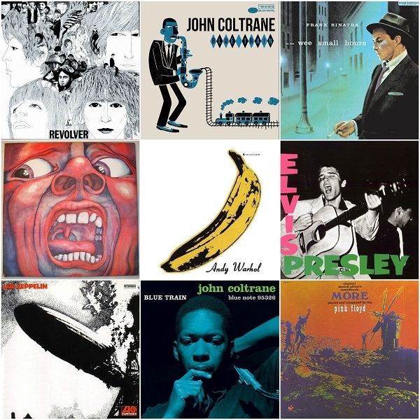
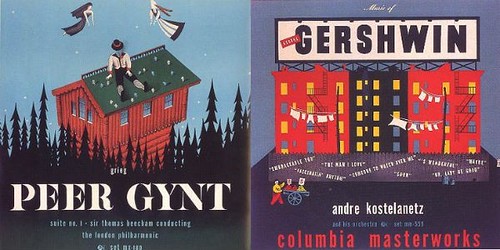
In fact, the artist made an incredible breakthrough in the commercial sphere and in the field of fine art, as he created a separate conceptual direction. At the age of 21, Alex Steinweiss already became an art director of Columbia Records. His works are now considered icons of the genre. And it’s not hard to imagine how much visualization of the classics and the golden age of jazz contributed to the spreading of music among people. And it was all glam up with bright mini-posters. Works of Alex Steinweiss were seen by everyone who saw the music covers: George Gershwin, Imperial orch under Rich. Rogers, Grieg 'Peer Gynt', Jazz 'From Then Till Now' and many others.
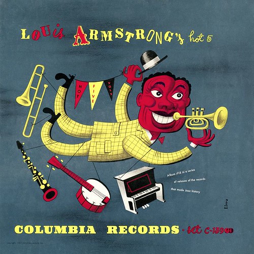
In the 1940s, Columbia Records continued its design traditions and not only remained as the creator of a separate art direction, but continued to be number one in this direction. Jim Flora intercepted this race, or rather the brush, from Steinweis.
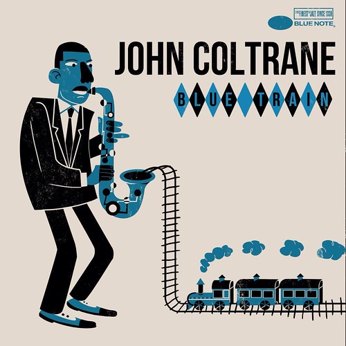
It was he who painted the covers to Louis Armstrong and John Coltrane, and also created his own unique artistic style, in which some kind of childlike immediacy, animation, angularity and African brightness are visible. Artist also worked with RCA Victor. And there, already in the 1950s, he applied his talent to a considerable amount of album art.
Jim Flora influenced a lot of contemporary artists, including Peter Hans Docter, lead animator and director of Pixar Animation Studios and Josh Agle, better known as Shag.
Moving one decade forward, it's worth saying that Jim Flora worked as art director at 'Park East' magazine in 1952, where he brought his first illustrations to young Andy Warhol. Who knows, maybe the famous banana on the debut album of Velvet Underground was also made not without Jim Flora influence. But let's talk more about it later.
More and more photos have been used in the cover artworks at the beginning of the 1950s. The focus was made on the image of the artist himself, and not on the image of emotions from music on paper.
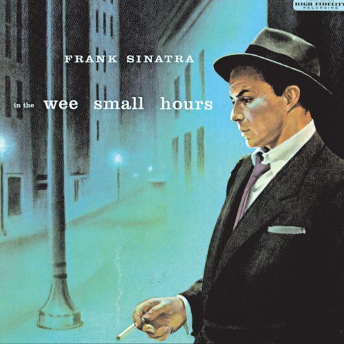
The digital universe and the history of the arts did not identify specific authors of that decade. It is known that Jim Flora and his subordinates continued to work, as well as several works that became gold standards were released on the Capitol Records label. Among the most significant is Frank Sinatra's 'In the Wee Small Hours' record, the picture of which refers to the noir genre in its sample state, and the release itself is one of the first concept albums.
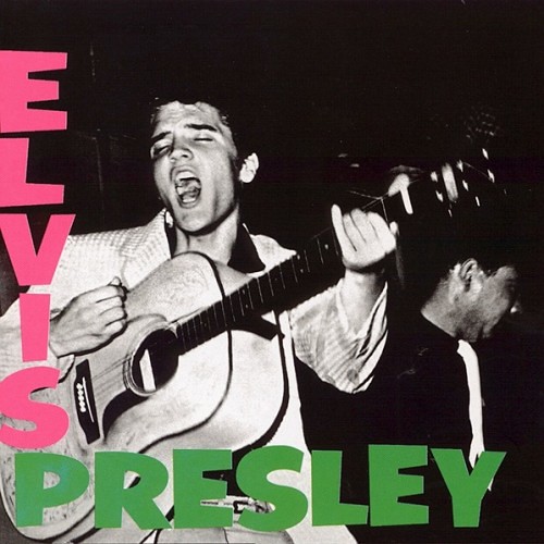
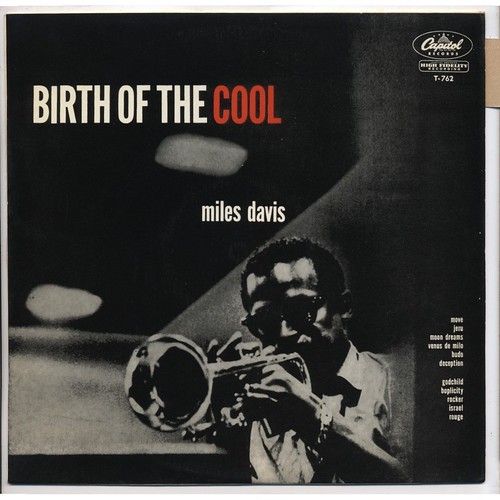
The 1950s was rockabilly golden age and time when a lot of jazz was released. Famous Charlie Parker, Dizzy Gillespie 'Bird & Diz', John Coltrane 'Blue Train', Miles Davis 'The Birth of the Cool', Chuck Berry 'Chuck Berry Is on Top' and Elvis Presley 'Elvis Presley' was released at this time. By the way, the last one became a design disc for The Clash 'London Calling' and Tom Waits 'Rain Dogs' later. It was also copied by a Russian singer with a guitar on a float-boat, who does not like the Rolling Stones.

The biggest and dramatic development of the album art genre took place in the 1960s. Any fan of the “children of flowers” era at the mention of cover arts from that period, will reflexively shout the word 'Beatles' and will be right. Many connoisseurs of that time put the concept and design of the album 'Sgt. Pepper’s Lonely Hearts Club Band' at first place. Cover art was created by artist Peter Blake and photographer Michael Cooper, not without Paul McCartney, who put his thoughts into the visual design of the album.
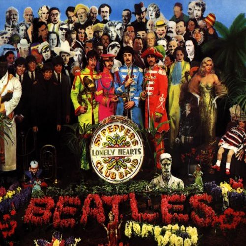
In general, all the covers of the Beatles are something like a masterpiece, and not only for that time. Their album art still looks relevant, fresh and organically. It's not about vogue for Britpop 20 years ago or for indie now, it's about time that spares nothing, and The Beatles covers continue to become classics for the next neo-subculture. At least three more deserve attention.
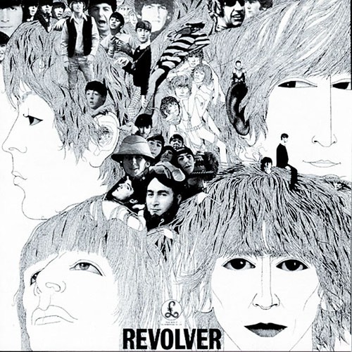
Album art to 'Revolver' was painted by artist Klaus Voormann, partly a member of the group Manfred Mann. The picture for the record with four portraits of the Beatles members was drawn with a ballpoint pen, and there were collages with a group behind them that photographers Robert Freeman and Robert Whittaker were shooting.
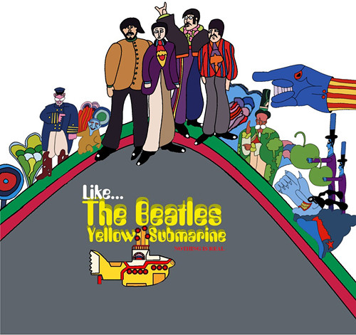
Next on the list is the 'Yellow submarine' psychedelic cartoon filmed by director George Dunning, a Canadian who moved to London. Let the special articles and Wikipedia tell about the animated movie. It's enough to take a look at the psychedelic tones of the cover design to understand what is going on in this soundtrack and who and where will go on the submarine.
It's impossible not to mention one of the coolest The Beatles album art, which was made not in the form of an illustration, but in the form of a photo. This is the penultimate work of the team - 'Abbey Road'. Probably, almost everyone saw four members of the group one by one on a crosswalk in London.
The album was designed by photographer Ian MacMillan. 10 minutes only were allotted for the filming then, as there was heavy traffic on this street. Subsequently, these 10 minutes created a masterpiece, which is still quoted, replicated, parodied and considered as one of the standards of musical album designs.

The 1960s became famous not because of the Beatles only of course. And not England only. On the other side of the Atlantic, masterpieces were already stamped in their entirety. Literally. Andy Warhol, the author of the cover of The Velvet Underground & Nico, was one of the first to use silk screen process or screen printing. The cover of the first album of the pioneers of alternative music is a banana on a white background with the artist’s signature and a small inscription 'Peel slowly and see'.

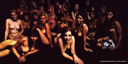
Jimi Hendrix distinguished himself in 1968 with his 'Electric Ladyland', the one with a mass of naked young ladies. The musician did not like the cover, which was made by photographer David Montgomery, as the guitarist initially planned to ask Linda Eastman (McCartney’s future wife) to capture a group of people with children against the backdrop of Alice in Wonderland sculpture in Central Park, New York. But, the label decided differently and the cover was called pornographic by some record dealmakers. The material came out under the patronage of the company Polydor in Europe.
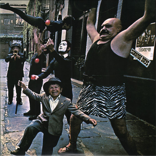
The band The Doors also distinguish themselves with their cover photo for the album 'Strange Days', which was released in the United States in 1967. The record is decorated with street performers from Manhattan. It came out that day there were only a few performers, so Joel Brodsky’s (photographer) assistant played the role of the juggler in the photo, and random taxi driver portrayed playing the trumpet for a nominal fee of $5.
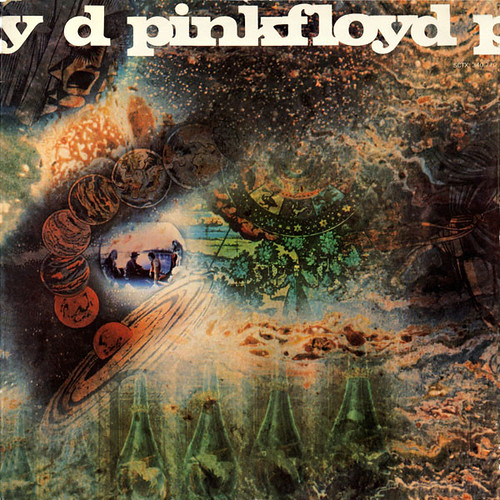
When describing the 1960s and all the bright psychedelic and fluorescent tones of that years, forgetting Pink Floyd is a real profanation and a crime against the cosmos with its fatal component. In terms of album art, three interesting works were released at that time: A Saucerful of Secrets (1968), More (1969) and Ummagumma (1969). It is enough to take a look at the first design in order to understand how vivid was reality experienced by all those who were involved in the album.
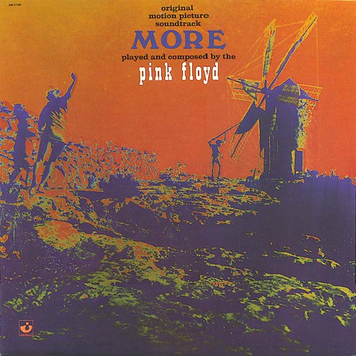
The second album 'More' became the first LP soundtrack for the band and the first one played without the main traveler of the psychedelic worlds of Syd Barrett. It has less tones and more conceptual art and symbolism in the design.
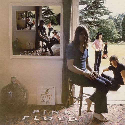
And, perhaps, the strangest release of Pink Floyd 'Ummagumma', that was released in 1969, also deserves attention. It was also a photo used in the design of the vinyl, only with reference to reflections and infinity. Most music lovers repeatedly stumbled upon this art and immersed themselves in universal thoughtfulness while contemplating it.
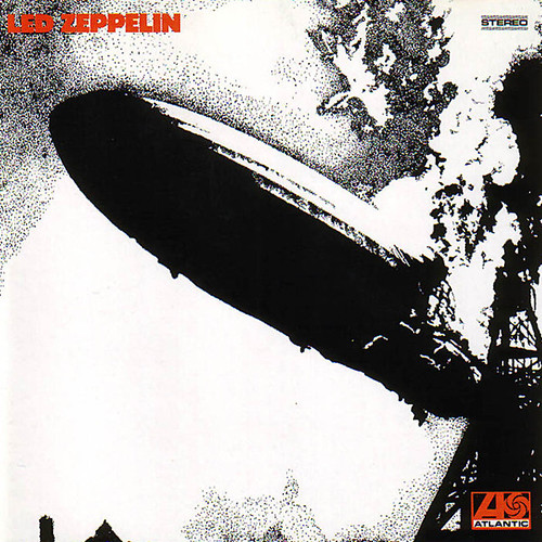
The end of the hippie decade was perfectly finished by Led Zeppelin with their self-titled debut, which depicts the first moment of the Hindenburg airship ignition. This art played bad to musicians and made some black and white PR at the dawn of their career. During the concert of the almost unknown at that time band in Denmark, a relative of von Zeppelin (the creator of the airship) threatened that she would cancel the group's concert through court. Then, instead of Led Zeppelin, musicians had to perform on stage in Copenhagen called themselves The Nobs.
Another brilliant finale of the 1960s was the first King Crimson album. Its visual component with a distorted face in bright colors perfectly illustrates the completion of a great psychedelic era. And, perhaps, even a glance to the left on the design of 'In the Court of the Crimson King' reflects the horror of the bad trip, which used to happen a lot at that time.
According to Robert Fripp - this is exactly that Schizoid Man with a song about which one of the most influential progressive rock records begins. The author of the album art was Barry Godber, a computer programmer (yes, even then), who died of a heart attack at 24 almost immediately after the release of the album.

Album art only began to form styles and create some kind of genre rules at the first three decades. Not only illustration was on top, but photographs, collages, calligraphy. In the following decades, even years, there was more and more music. Of course, everything that was recorded needed to be "presented".
In the 1970s, punk appeared, then industrial, then hardcore, and lots of other bright styles. There is still a lot of stories ahead: about DIY, comics, mascot, traditions in visual designs of different styles - heavy and not. But, let's talk about this in details later. Music Meets Art has just begun, and how much is still ahead.
To be continued…
We'll start from the 1970s and gradually get closer to our time in the next issue. Ahead of a brief history, different directions, continents, countries, authors. Ahead of the whole palette of colors in combination with sounds and text that draws from this and more - follow Music Meets Art.
The material was prepared with the support of:
RobustFellow Bandcamp Facebook VK Twitter
Ethereal Riffian Bandcamp Facebook VK
All the parts of the material are here:
https://www.neformat.com.ua/rubrika/music-meets-art
All images are copyrighted by their respective copyright owners.